Streamlining ZOLEO's Device Management
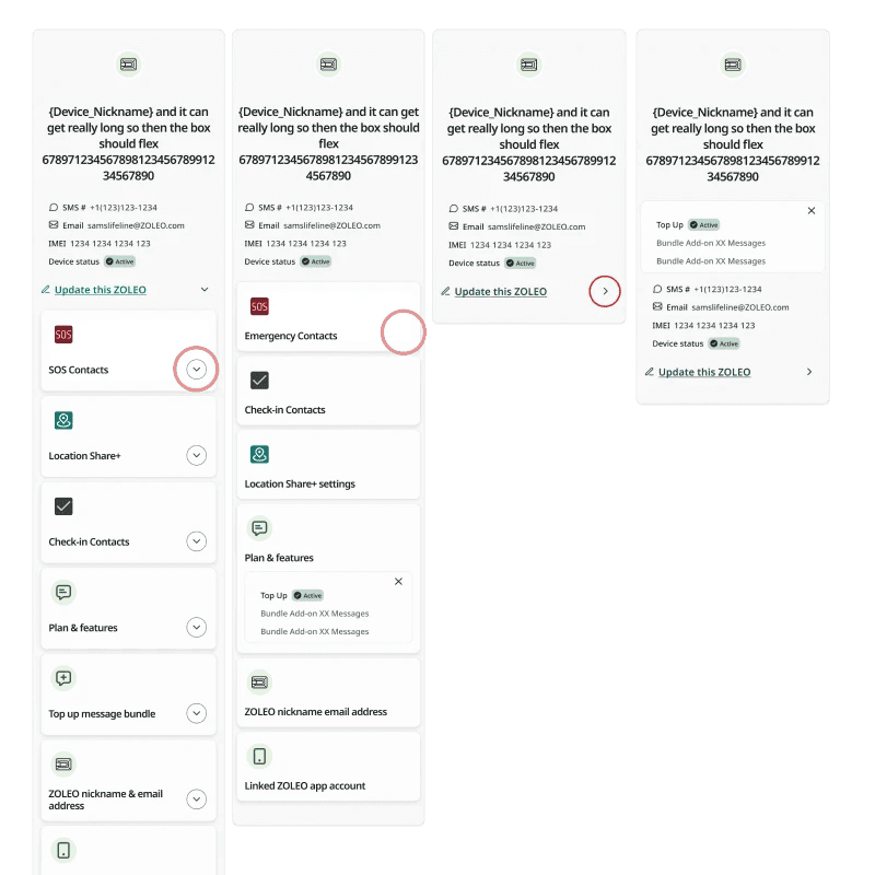
Overview
Duration: Q3-Q4 2023
Role: Sole Designer (Dennis Buizert)
Objective: Optimize user experience in the redesigned Device Management interface
Challenge
ZOLEO's Device Management system, a cornerstone of their B2C offerings, was buckling under the weight of B2B demands. As the sole UX designer tasked with this Herculean challenge, I found myself staring at a Gordian knot of user frustrations, technical limitations, and business pressures.
The numbers told a grim tale: 15% of users grappling with activation issues, a 10% dip in customer satisfaction, and a support team drowning in tickets. Our system, designed for individual users, was now expected to juggle accounts managing over 20 devices. It was like asking a bicycle to perform like a bus – something had to give.
Key Challenges:
Navigation Overload: Complex expanding/collapsing sections caused user confusion
Limited User Guidance: Technical constraints hindered implementation of targeted guidance
Communication Gap: Business unable to direct users to specific settings
Scalability Issues: Lack of B2B scaling support in the existing Customer Portal
Challenges & Solutions
Challenge:
The existing Device Management system's account creation, billing, and device activation process was complex and time-consuming, leading to significant user frustration and support costs. Specifically, 15% of users experienced activation issues, resulting in a 10% decrease in customer satisfaction and increase in support tickets.
Solution:
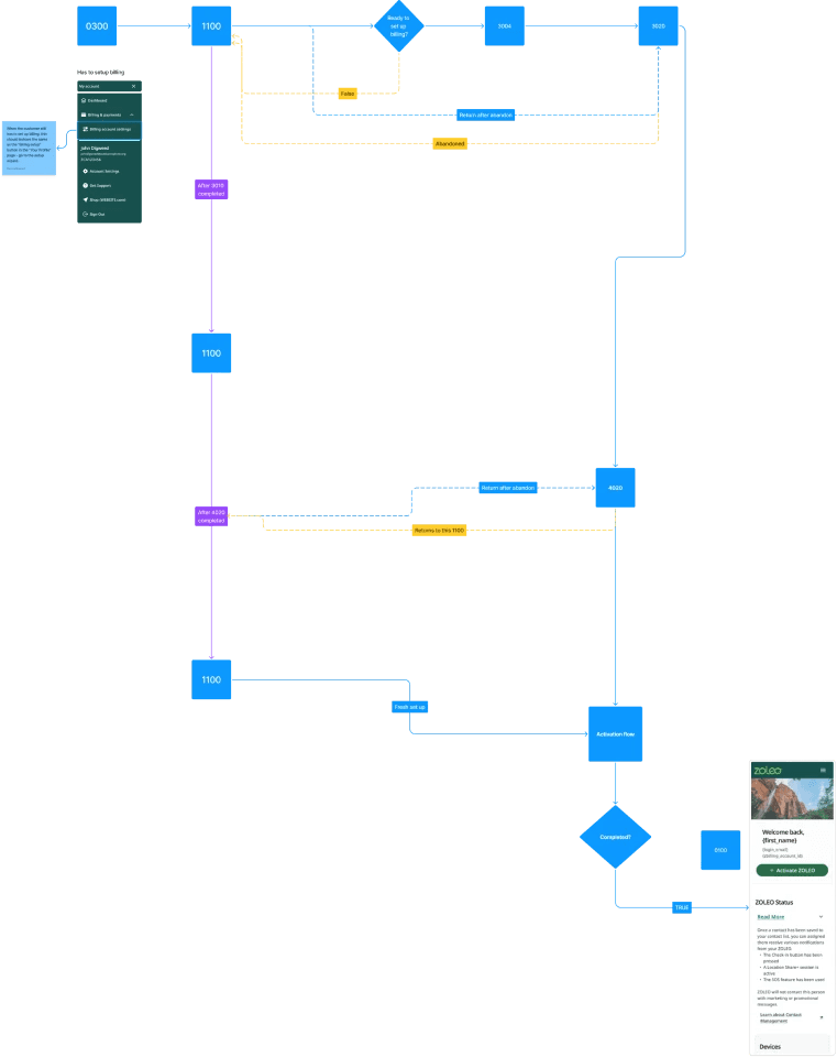
To address these challenges, we conducted extensive user research and collaborated with technical stakeholders to redesign the activation flow. The new flow simplified the process by reducing the number of steps, providing clear progress indicators, and automating certain tasks.
Key Improvements:
Progress Indicators: Clear visual cues, such as progress bars and step-by-step instructions, guided users through the activation process, reducing confusion and anxiety.
Error Handling: We implemented robust error handling mechanisms to provide informative messages and suggestions, helping users resolve issues independently.
Automation: Build-in progress save and auto-fill input fields with provided user data.
Initial results: The redesigned activation flow resulted in a significant improvement in user experience and operational efficiency. Key outcomes from internal testing include:
Reduced Activation Time: The average activation time decreased by 30%, resulting in a more streamlined and satisfying experience for users.
Decreased Support Costs: The number of support tickets related to activation issues decreased by 25%, reducing the overall support burden and associated costs.

Unraveling the Knot
The Approach
Armed with our newly deployed UX Tracker, I dove deep into the user journey. The data painted a vivid picture of user pain points:A labyrinthine activation process that left users lost and frustrated.Bulk device management was a pipe dream, forcing B2B clients to lean heavily on our already strained customer service.A terminology jungle that confused users about simple actions like pausing or canceling services.
The challenge was clear: simplify the complex, guide the lost, and speak the user's language. But the path to this solution was far from straightforward.
Activation Flow Redesign
Goal: Simplify account creation, billing, and device activation
Key Improvements:
Progress indicators
Enhanced error handling
Automation features (progress save and auto-fill)
User Research and Analysis
Deployed UX Tracker for insights into user experience
Identified pain points in device creation, management, and deactivation processes
Activation Flow Redesign
Goal: Simplify account creation, billing, and device activation
Key Improvements:
Progress indicators
Enhanced error handling
Automation features (progress save and auto-fill)
The Plot Twist: Technical Constraints
As I began sketching out solutions, a curveball came our way. Our development team, in the midst of implementing a new CMS (Prismic), hit a wall. The disclosure functions I had meticulously designed – our silver bullet for information overload – were incompatible with the new system.
With the project in its final stages and a looming deadline, I had to think fast. It was time for a pivot.
The Interim Solution: A Bridge Over Troubled Waters
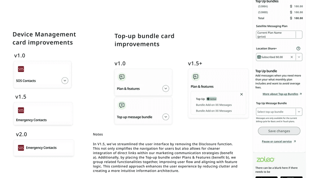
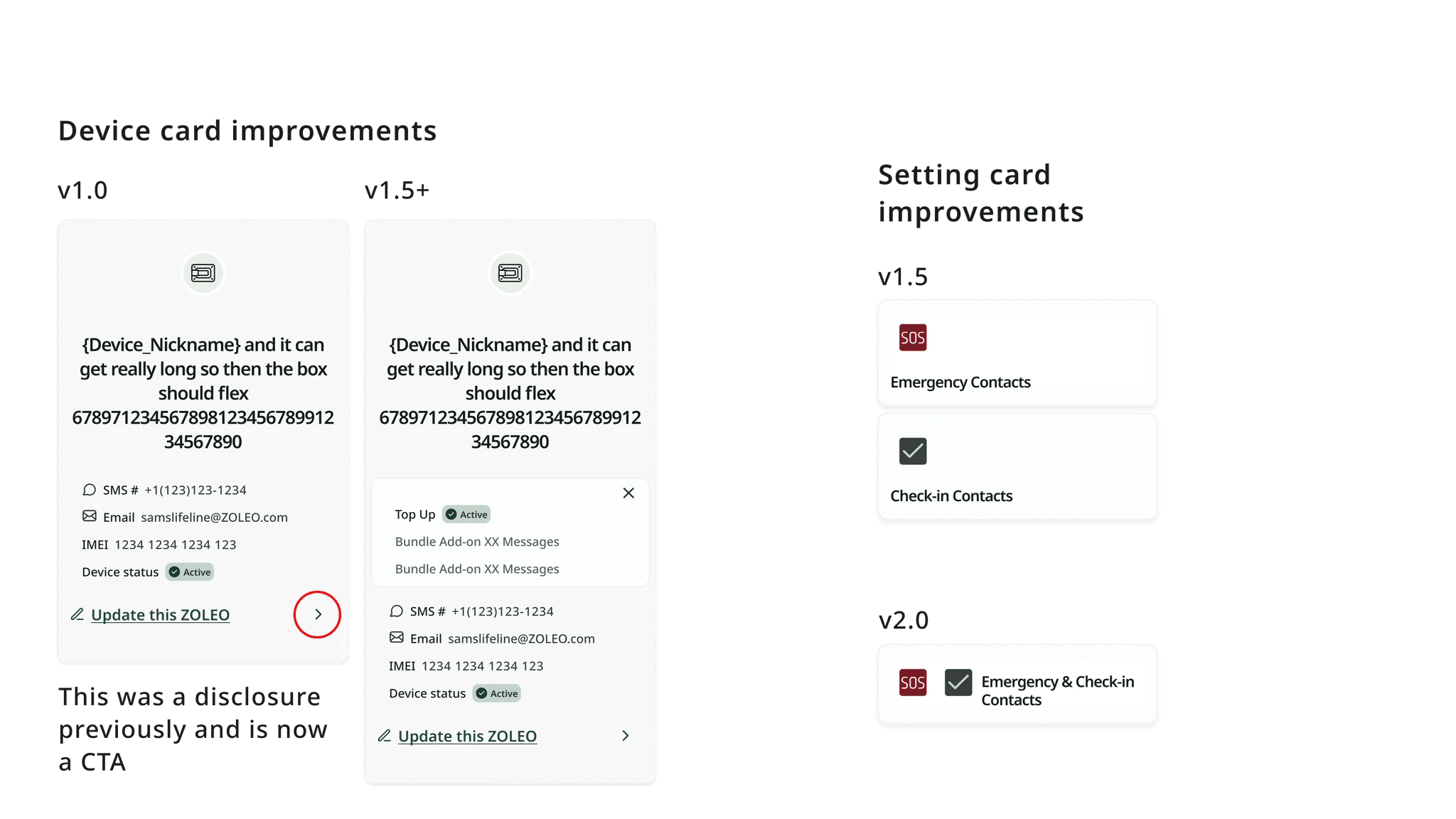
Recognizing that perfection was the enemy of progress, I proposed an interim solution – version 1.5. This approach would:
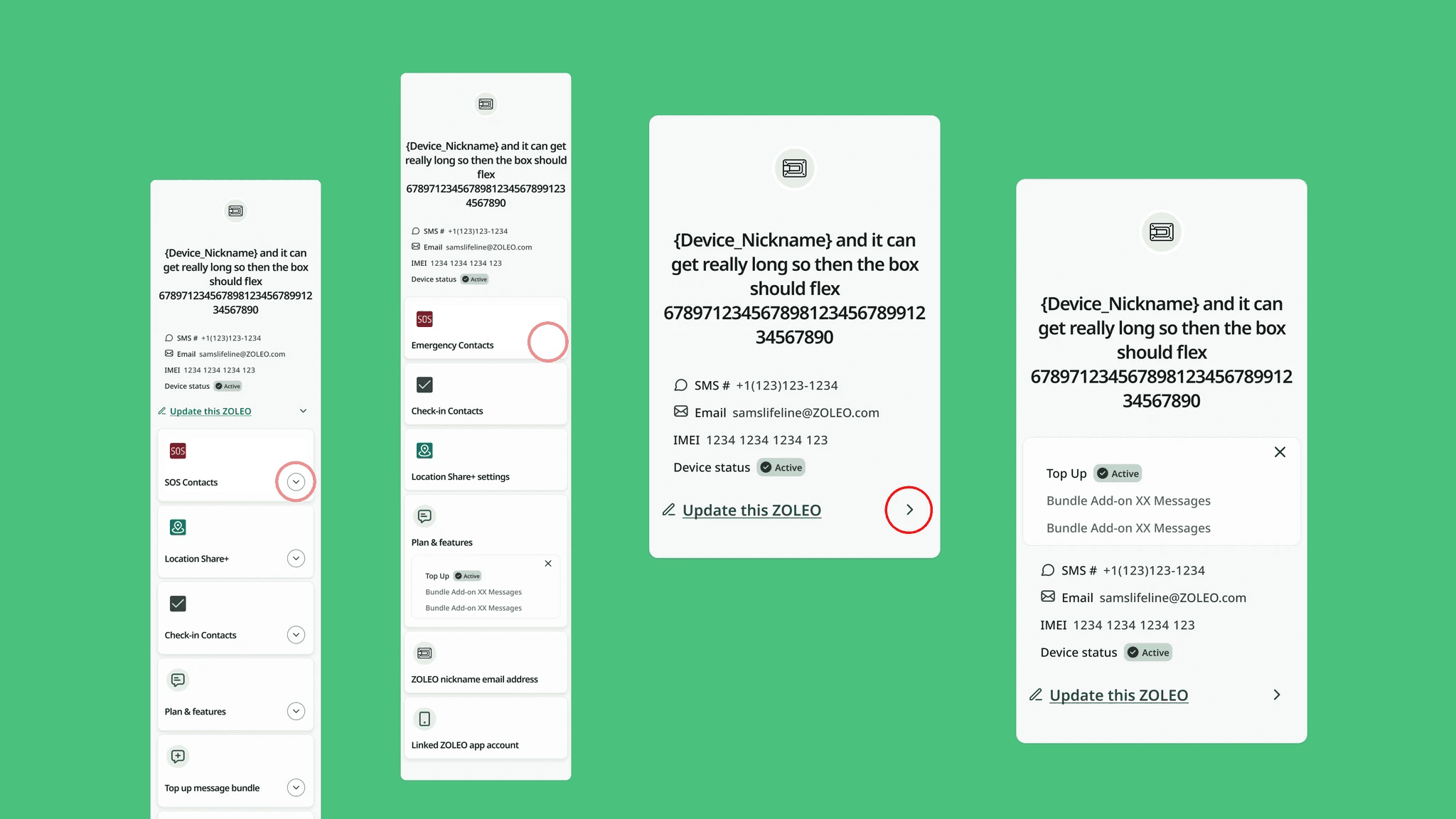
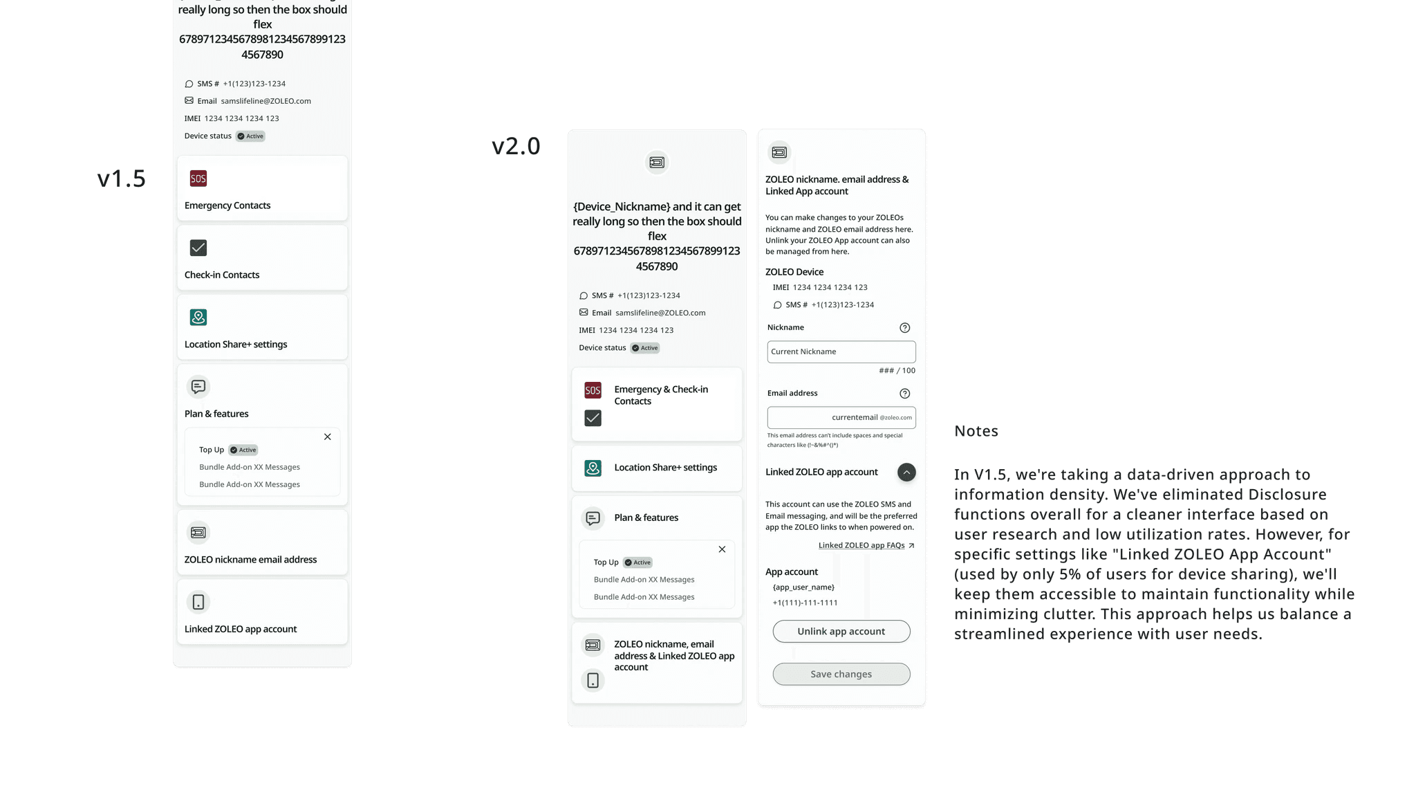
Replace the problematic disclosure features with dedicated pages for device settings.
Combine Plans & Features pages for streamlined navigation.
Implement a cookie-based system to guide users through the activation process, a clever workaround to the CMS limitations.
This wasn't just a band-aid; it was a strategic move to buy us time while laying the groundwork for a more comprehensive overhaul.
Addressing Automation Challenges
Problem: Unexpected issues with initial automation implementation
Solution:
Collaborated with technical team
Designed streamlined user flow
Implemented interim solution using browser cookies
Navigation and Interface Improvements
Shifted from disclosure function to dedicated pages for device settings
Combined Plans & Features pages for efficient navigation
The Results: Small Changes, Big Impact
The interim solution, implemented with minimal development effort, yielded surprising results:
Activation time plummeted by 30%.
Support tickets related to activation issues decreased by 25%.
User feedback indicated a clearer, more intuitive experience.
We had turned the tide, but the journey was far from over.
Looking to the Horizon: Version 2.0
With version 1.5 holding the fort, I set my sights on the future. Version 2.0, slated for Q4 2024, promises to be a game-changer:
A complete redesign focused on intuitive navigation and minimal cognitive load.
Seamless integration with Prismic, allowing for dynamic, context-sensitive user guidance.
A flexible architecture capable of growing with our B2B clients' needs.
Planned Improvements
Streamlined organization with dedicated pages for device settings
Enhanced navigation with minimal scrolling and intuitive information architecture
Empowered communication through integration with Prismic for contextual guidance
The Lessons Learned
This project was a masterclass in adaptability, user-centric design, and the art of the possible. Key takeaways include:
Listen to the Data: Our UX Tracker was invaluable in identifying and prioritizing user pain points.
Embrace Constraints: Technical limitations forced creative solutions that ultimately benefited the user experience.
Iterate with Purpose: The interim solution wasn't just a stopgap; it was a learning opportunity that informed our long-term strategy.
Cross-Functional Collaboration: Close work with developers and business stakeholders was crucial in navigating complex technical and business requirements.
The Road Ahead
As we gear up for the V2.0 rollout, the future looks bright. We're not just fixing a system; we're reimagining how businesses interact with their devices at scale. This project has laid the foundation for a more intuitive, scalable, and user-friendly Device Management system that will serve as a cornerstone of our B2B offering for years to come.In the end, what started as a UX challenge became a testament to the power of user-centered design, agile thinking, and perseverance in the face of adversity. It's a story of how small, strategic changes can lead to significant improvements, paving the way for revolutionary transformations.
