This ongoing case study serves as a platform to share my learnings and document my progress in refining and optimizing this design system.
Evolving a Design system
While the design system I worked with at Company X was functional, the rapid pace of technological advancements and the evolving landscape of design tokens prompted me to revisit and modernize it.
Simplify and condense
The design system at Company X is currently spread of several files as a way to reduce load time. My goal is to simplify and condense the design system as it currently stands. he design processes have improved in the last 2 years and we can significantly reduce the amount of files and condense them into 1 design system file.
The goal here is to develop a distinct design principle by outlining the differences in the foundations and the component library. By determining what is baseline and what isn't, we can create a strong foundational file that all other components borrow from.
By applying a hard definition of what is OUR design system, we can include or remove items from the design system. If it not part of this definition it will become part of the component library.
The design system's definition
A design system is a comprehensive set of standards, documentation, and reusable components that guide the development of digital products within an organization. It serves as a single source of truth for designers and developers, ensuring consistency and efficiency across projects.
Any design elements that do not fall within the scope of the core design system should be incorporated into the component library. Components play a crucial role in the CI/CD pipeline, ensuring the system's adoption, flexibility, and longevity. Regular evaluation of the component library is essential to maintain its relevance and effectiveness.
Current design system structure looks like (all in separate files)
Foundations
Buttons & Controls
Form
Navigation
Feedback components
Tooltips
Card modules
Page Templates
Chips, badges, Tags
Interactive components
Content molecules
Icons & icon wrapper
Condense and reduce
By establishing a clear distinction between design system elements and component library items, I will enhance the design and file management processes. This structured approach ensures that changes made to the design system seamlessly flow into the component library, ultimately impacting the final designs. Here's a brief example of how this improved workflow will benefit the project:
Design system
Foundations
Color
Typography
Dimensions
Guidelines
Buttons & Controls
Chips, badges, Tags
Forms
Navigation
Feedback components
Tooltips
Page templates
Icon wrapper
Component library
Card modules
Plans
Registration & Activation
Content molecules
Headings
Body content
To maintain consistency and prevent unintended modifications to the core design system, we should establish a formal process for safeguarding finalized flows that have been approved by stakeholders and implemented. These approved flows should serve as the definitive reference for future development.
Any changes that do not directly impact the design system can be implemented through a pre-defined workflow, ensuring that alterations align with established guidelines and maintain the integrity of the overall design.
Fine-tuning the system and components
By analyzing our design system, I've identified key areas for improvement:
Tokens: We'll optimize color, typography, sizing, and spacing tokens to streamline implementation.
Icon Flexibility: Using tokens and scaling functions will enhance icon versatility.
Button System: We'll adopt a proven button system and adjust it quickly with tokens.
Form Improvements: Leveraging white-label components will resolve past form issues and enable rapid adjustments.
Feedback and Tooltips: We'll evaluate and adjust flexibility through improved tokens.
These improvements will enhance the overall quality and usability of our design system, ensuring a solid foundation for our product.
After the analysis of current tokens, I applied the improved tokens to the components throughout the design system and component library. This implementation ensured a consistent and unified visual language across the entire product, enhancing the overall user experience and simplifying future updates and maintenance.
Sizing and spacing turn into dimensions
In the early stages of using Tokens Studio, we initially specified sizes and spacing as separate tokens. However, this approach introduced unnecessary complexity and maintenance overhead, as it required tracking and managing two distinct token groups.
Sizing
Spacing
size.fixed.xs
32px
{size.8}
size.fixed.sm
40px
{size.10}
size.fixed.md
48px
{size.12}
size.fixed.lg
56px
{size.16}
size.fixed.xl
64px
{size.20}
size.fill
fill_containter
fill_containter
size.hug
hug_contents
hug_contents
paragraphSpacing.default
0
space.between.fixed.xs
4px
{space.fixed.1}
space.between.fixed.sm
8px
{space.fixed.2}
space.between.fixed.md
16px
{space.fixed.4}
space.between.fixed.lg
32px
{space.fixed.8}
space.between.fixed.xl
40px
{space.fixed.10}
space.between.fill
equal
{space.fill}
Utilizing the dimension token
To enhance efficiency and adaptability, I implemented a Dimension token in Tokens Studio. This versatile token consolidated multiple design properties, including sizing, spacing, border radius, border width, and background blur. By reducing the number of individual tokens, I simplified the design system and minimized potential inconsistencies.
This approach also improved future-proofing. The comprehensive Dimension token allowed for greater flexibility, ensuring that the design system could easily adapt to evolving trends and requirements without significant restructuring.
dimension.token.name.here
1rem
{global.token.1}
Token implementation example
xx.fixed.size.icon.contained.md
1rem
{xx-dimensions.5}
Label
xx = brand
fixed = fixed width or height
size = icon size
contained = location of the icon. Contained inside a component or standalone outside a component.
md = component size (xs, sm, md, etc.)
Enhancing Icon Flexibility and Adaptability
The initial design system, developed in 2022, faced limitations due to the early stages of Figma and its associated tools. To address these constraints, the Lead Designer implemented a creative workaround using multiple icon wrappers. This innovative solution enabled us to maintain design flexibility within the available technology, demonstrating adaptability and problem-solving skills.
iconwrapper.sm
16px
{size.4}
iconwrapper.md
20px
{size.5}
iconwrapper.lg
24px
{size.6}
iconwrapper.xl
32px
{size.8}
iconwrapper.2xl
48px
{size.12}
To overcome the limitations of traditional static icons, I implemented a dynamic system for handling icons within our design system. By collaborating with Sam Gordashko from Tokens Studio, we transformed the formatting of icons to allow for scalable and adaptable usage. This innovative approach ensures that icons maintain their visual integrity and consistency across various sizes and contexts. By optimizing icon handling, I improved the overall flexibility and adaptability of our design system.
Optimizing Icon Wrappers with Token-Based Approach
By digging into the intricacies of design systems and tokens, I optimized the icon wrapper process. Through strategic token application based on icon placement, I reduced the number of required icon wrappers from five to a single, streamlined instance.
For instance, when an icon is situated within a button, I apply the button's logic to the icon, ensuring a cohesive and efficient design. This optimization not only simplified the overall design system but also enhanced its maintainability and scalability, making it easier to manage and adapt to future changes.
Through the strategic implementation of dimension tokens, I successfully reduced the overall number of tokens required in our design system. This streamlined approach not only simplified the system but also significantly improved performance.
By minimizing the number of tokens, I achieved faster load times for both design files and the final product, enhancing the development process and ultimately delivering a better user experience. This optimization showcases my ability to balance design efficiency with end-user satisfaction.
icon-end
height:
density.fixed.size.icon.standalone.md
width:
density.fixed.size.icon.standalone.md
fill:
mode-color.fg.interactive.primary.default
dimension:
density.fixed.size.icon.standalone.sm
Rebuilding Buttons and Interactive Components for Future Compatibility
The existing buttons and interactive components within our design system are currently limited in their functionality and flexibility, primarily designed for web development. To address this and prepare for future expansion into B2B dashboards, Android, iOS, and other products, I propose rebuilding these components.
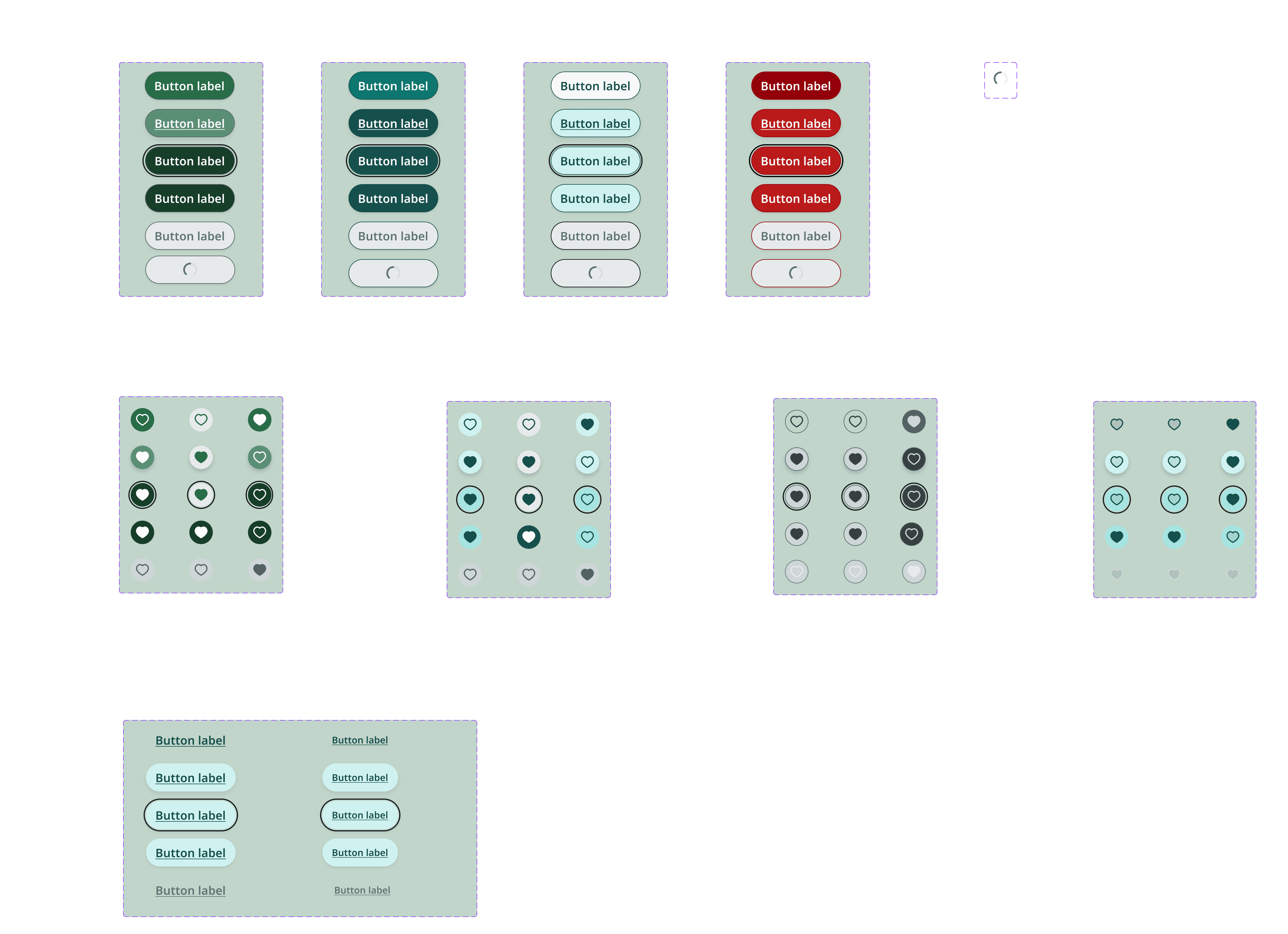
By rebuilding buttons and icon-buttons, we can ensure their compatibility with a wider range of platforms and devices, enhancing the longevity and adaptability of our design system.
By incorporating a tokenized white-label design system that I contributed to, I was able to rapidly replace the existing buttons in the project. This streamlined process ensured a consistent and cohesive visual language across the entire product.
Button/small
Standalone
Label
Label
Label
Label
Label
Label
Label
Contained
Label
Label
Label
Label
Label
Label
Label
iconButton/small
Standalone
Contained
The next step involves systematically replacing all remaining buttons in the design files with the new, tokenized versions. This will further enhance the product's visual appeal and maintainability.
Addressing Form Issues in the Design System
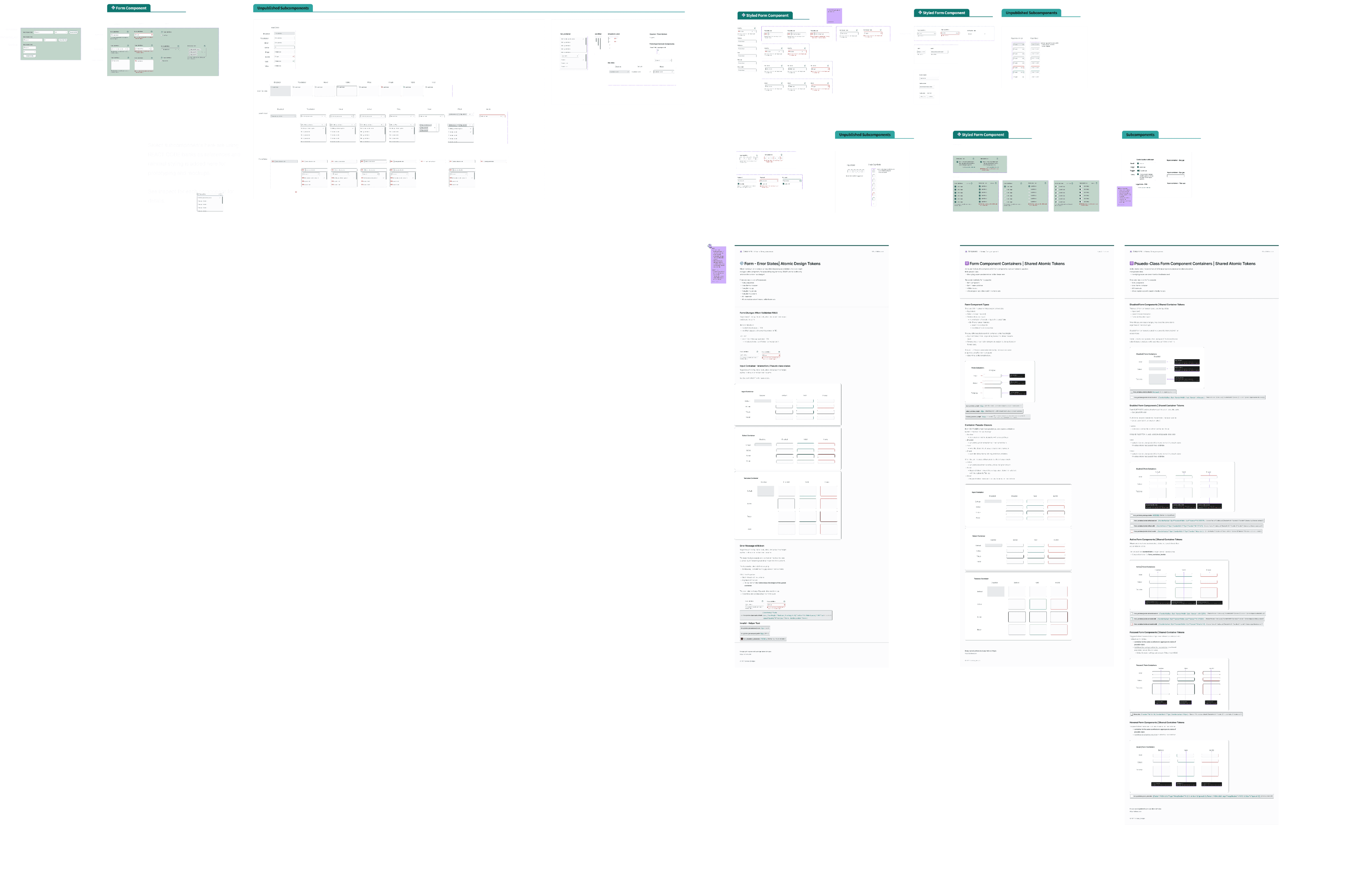
The forms component in the existing design system has historically been problematic, experiencing frequent breakage due to Figma or component updates. This has resulted in inconsistent formatting and blank displays.
With a deeper understanding of design systems, component building, and tokenization, I am well-positioned to rebuild the forms component. This rebuild will address the existing issues and ensure a more robust and reliable solution.
Rebuilding Forms with White-Label Components
To address the challenges with the existing forms component, I will leverage the same white-label components from the forms set. These components were designed for seamless integration into various systems, particularly when token names align. This plug-and-play approach will expedite the rebuilding process and ensure a more reliable and maintainable solution.
The white-label forms will serve as the base for the rebuilt components. To incorporate company-specific elements, I will utilize a component swap function. This approach will allow for seamless integration of custom components, ensuring a tailored and branded user experience.
Rebuilding the forms component not only addresses current limitations but also positions our design system for future growth. By modernizing the forms, we can ensure that they remain adaptable and scalable, allowing us to easily meet evolving business goals and implement new features without compromising the overall design integrity.
Next Steps for Design System Implementation
Once the design system rework and token application are complete, several key steps remain:
Implement Living Documentation: Transition the design documentation to a living format, allowing for automatic updates based on token changes.
Swap Components: Replace the old components in existing designs with the new, tokenized components.
Establish Maintenance Processes: Develop procedures for ongoing maintenance and periodic evaluations of the design system and component library.
Provide Education and Documentation: Educate stakeholders and developers on the updated design system, token system, and documentation guidelines.
By following these steps, we can ensure a smooth transition to the new design system and establish a sustainable framework for future development.
Analyzing Designs for Component Library Expansion
As part of the design system overhaul, this presents an ideal opportunity to conduct a comprehensive analysis of existing designs. By identifying recurring patterns and elements, we can expand the component library, creating reusable components that can be applied across various projects and platforms.
This proactive approach will not only streamline future design efforts but also ensure that the design system remains adaptable and future-proof, supporting the introduction of B2B solutions, smartphone applications, and other product updates.


